

• Dubious Positive Biases in Revised U.S. Economic Statistics
Posted by Ron Robins on April 9, 2014
Why do most of the methodologically revised U.S. economic statistics tend to create a picture of a more positive looking economy? Do these revised statistics really give a better—or illusory—understanding of economic activity? And is it coincidental that the benefits flowing from these more positive looking statistics largely accrue to powerful elites who also have the muscle to influence the statistical methodologies? Now those who should be investigating and informing us of these concerns, our economists and media, fail to do so.
We see this ‘positive bias’ appearing in the most important economic statistics, including unemployment rates, payroll numbers, the consumer price index (CPI), savings rates, and gross domestic product (GDP).
Considering the unemployment rates and payroll numbers, we find that the Bureau of Labor Statistics (BLS) has implemented many changes that have resulted in lower unemployment rates and higher payroll numbers.
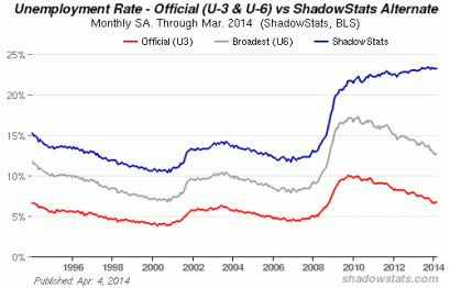
One particular change in 1994 to the unemployment rate was most significant. At that time the BLS decided to exclude the long-term (over one-year) unemployed discouraged workers from measurement. The chart below, from ShadowStats, shows that revised rate, now referred to as the Official U3 rate, as the red line.
The unemployment rate including these long-term unemployed discouraged persons is the ShadowStats blue line. The broadest government unemployment rate U6 is the gray line, which ShadowStats says, includes “short-term discouraged and other marginally attached workers as well as those forced to work part-time because they cannot find full-time employment.”
Using March 2014 unemployment data, notice the huge difference in unemployment rates between the pre 1994 methodology, which ShadowStats estimates at 23.2%, and the much-publicized Official U3 rate of just 6.7% and U6 at 12.7%!
With reference to the BLS payrolls data, John Williams, ShadowStats founder, has regularly spotted “spurious revisions used to spike payroll employment levels.” He said of the March 2014 payroll report, that, “[The] increase of 192,000 was bloated heavily by concealed and constantly shifting seasonal adjustments… [that the] numbers remain of horrendous quality… generally not comparable with earlier reporting.”
Methodological changes to the CPI are also worrisome. Some non-government consumer price indices show exactly how much the government CPI has understated inflation that’s relevant to most people’s everyday experience. One such index is Guild Investment Management’s (GIM), Guild Basic Needs Index (GBNI). GIM says that because the BLS, “periodically alters its [CPI] content, making adjustments to the weighting of the components, and smoothing seasonal patterns. [That,] such tinkering with data… usually results in an understatement of the inflation rate and creates an unreliable, misleading cost of living index.”
The GBNI includes food, clothing, shelter and energy, covering 50-80% of most people’s expenditures. From the chart below see how over the five years to January 31, 2014, the annual increase in the GBNI was 4.7%, versus 2.1% for the CPI.

ShadowStats has re-worked the CPI as the BLS measured it with a fixed basket of goods in 1990 (see below), and in 1980 (not shown). Using the 1990 measure annual inflation in February 2014 was running at about 5%, blue line, versus under 2%, red line, for the Official CPI-U.

Changes to the personal savings rate methodology are of concern too. Negative personal savings rates in the past decade became positive. For instance, the personal savings rate (as a percentage of disposable personal income) in 2006 and 2007 was about -2% but has become +3% after revisions. Methodological changes in personal incomes and certain pension benefits, etc., had the effect of enhancing personal savings rates.
Regarding GDP, we see it has benefited from arguably bureaucratically lowered inflation rates. To arrive at ‘real’ U.S. GDP, the Bureau of Economic Analysis (BEA) reduces nominal (current prices) GDP by BEA’s own inflation measure. According to Mr. Williams, this measure shares many similarities to the CPI. One example is that it includes “quality-adjusted price indexes to deflate goods and services.” Hence, if a new computer has the same price as one several years ago but is many times more powerful, its price would now be deemed much, much lower, thereby lowering BEA’s price index and thus increasing real GDP.
To see exactly how these methodologies upwardly bias GDP, consider that BEA reported real GDP for 2013 at 1.9%. However, using the SGS-Alternate GDP that eliminates, as ShadowStats says, some of the “distortions in government inflation usage and methodological changes that have resulted in a built-in upside bias to official reporting,” real 2013 GDP would be about 4% lower and negative at around -2%!
These questionable brighter-looking statistics could be creating the illusion of a better economy. Coincidentally, such a possibly falsified, better-looking economy, greatly benefits some key political and financial elites who just happen to have disproportionate power to influence government statistical methods.
ShadowStats gives examples of the Johnson, Nixon, Carter, Reagan, Bush (first) and Clinton administrations engaging in acts to alter various economic statistics so as to put their respective administrations in a brighter light.
And the economic elite benefiting most from these more positive looking statistics pumping up the bond and stock markets are the ultra rich. Moreover, it is they who have an out sized influence on legislators and government policies and perhaps the most interest in adding gloss to the statistics.
Regrettably, those who should be critiquing and providing insight for the public about the meaning and consequences of the methodological changes to the statistics, our beloved economists, are missing-in-action. Economists, believing they are quasi-physicists of the economics realm, should be ashamed at their apparent near total public acquiescence to government statistical methods and methodological changes.
Sadly, the financial media is just as irresponsible too, parroting the statistical information spoon-fed to them by government. This is a situation suited to a dictatorship rather than an enlightened democracy.
When methodological changes to government economic statistics nearly always create a picture of a more positive economic reality, we have to doubt their integrity—especially when particularly powerful political and financial elites benefit the most from them. Alas, economists and financial journalists studiously avoid publicly critiquing the changing statistical methodologies. They treat government statistics as if they come down from God and written in stone. We deserve better in this enlightened age.
So, are these dubious, positively biased economic statistics providing improved insight into economic reality–or are they created to proffer the impression of a healthy economy?
© Ron Robins 2014

Dubious Positive Biases in Revised U.S. Economic Statistics said
[…] READ MORE HERE […]
LikeLike
diagnosis kanker usus 12 jari said
You actually make it seem so easy with your presentation but I find
this matter to be really something that I think I would never
understand. It seems too complex and very broad for me.
I’m looking forward for your next post, I’ll try to get the
hang of it!
LikeLike
Positive ‘Spin’ Grows U.S. Economy … But For How Long? said
[…] Underpinning the spin are U.S. government economic statistics. Unfortunately — and it seems unknown to even most economists — there are huge methodological and philosophical issues with these statistics, some of which I detailed in a recent post entitled Dubious Positive Biases in Revised U.S. Economic Statistics. […]
LikeLike